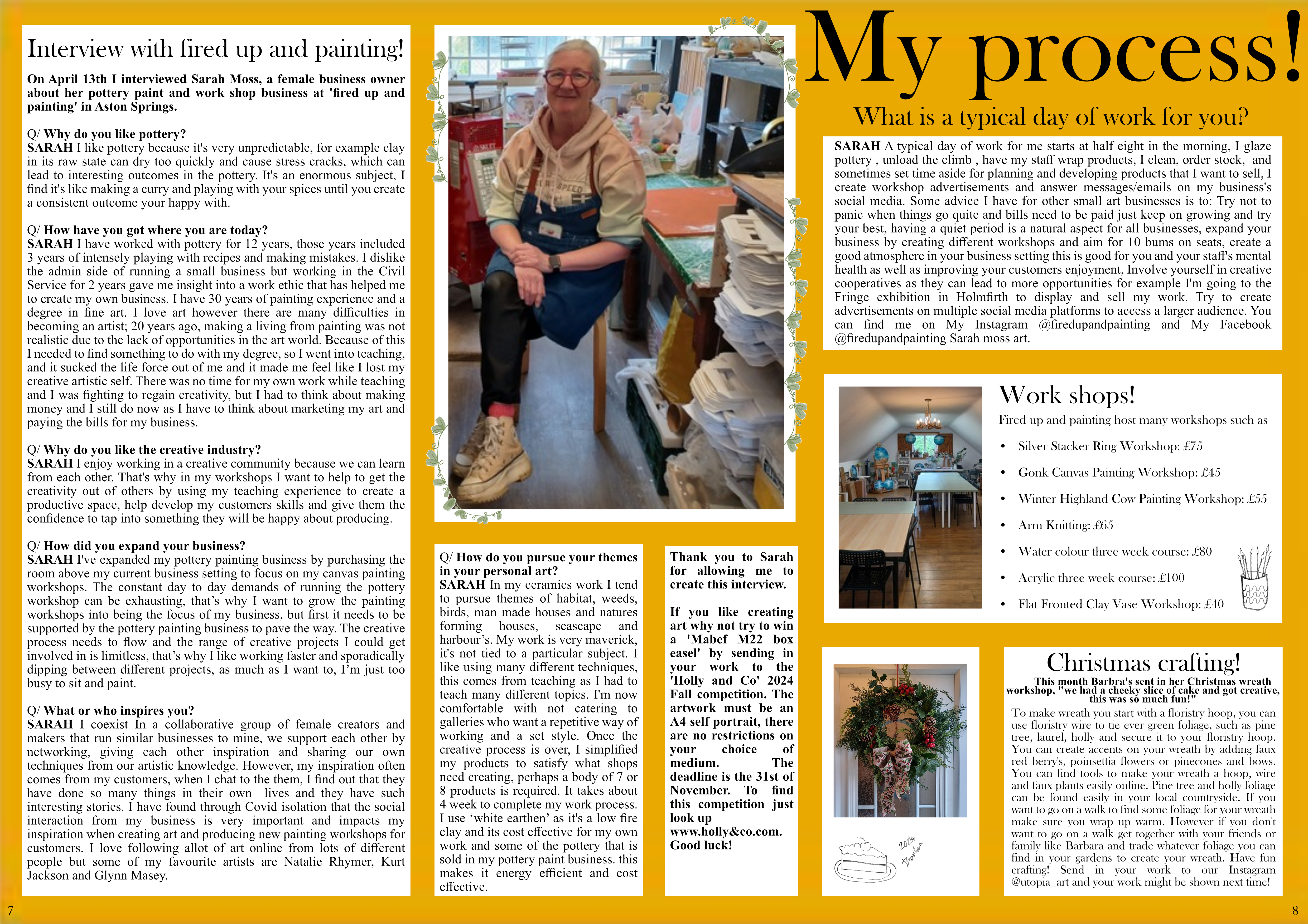
I made a page sized width 42 cm to length 29 cm. I first added a grid to my page using the view tab so that my pages would be even. I then added a line to the middle of my page so I could see where the crease would be. I made the page mustard yellow using the squire and colour selection tool. I made white boxes using the squire and colour selection tool to map up my text and images following my mock up layout. I used my house style typography Baskerville old face: body text size 12, masthead sized 96, tagline sized 24.

I added in and positioned my photos


I added in my updated interview body and sub-heading text. I changed the font to Times new roman. I changed the layout to fit all my text on the double page spread and I added in a editors note and competition advertisement.

I've gone on the 'Fired up and painting' Instagram page and added the resent workshops and prices they posted on Instagram to my DPS.

Instead of 'other work' I add in mini story to showcase a fan of utopia sent in their art:
This month Barbra's sent in her Christmas wreath workshop
"we had a cheeky slice of cake and got creative, this was so much fun!"
Send in your work to our Instagram @utopia_art and your work might be shown next time!

Added in page numbers.


This month Barbra's sent in her Christmas wreath workshop, "we had a cheeky slice of cake and got creative, this was so much fun!"
To make wreath you start with a floristry hoop, you can use floristry wire to tie ever green foliage, such as pine tree, laurel, holly and secure it to your floristry hoop. You can create accents on your wreath by adding faux red berry's, poinsettia flowers or pinecones and bows.
You can find tools to make your wreath a hoop, wire and faux plants easily online. Pine tree and holly foliage can be found easily in your local countryside. If you want to go on a walk to find some foliage for your wreath make sure you wrap up warm. However if you don't want to go on a walk get together with your friends or family like Barbara and trade whatever foliage you can find in your gardens to create your wreath. Have fun crafting!


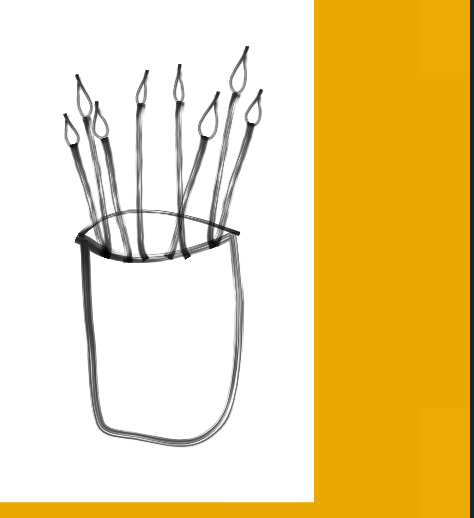
Using the draw tool I created a cake doodle graphic.


Altered the layout to make the fit of the text more visually pleasing and made the cake doodle graphic bigger.

Added in the wreath image I took and changed the position of the graphic


Uploaded the leaf graphics I made for my front cover.

Resized cropped and positioned of multiple graphic's to wrap around the DPS main image.

I duplicated the brushes I made and resized and rearranged them

I then did the same thing with the pottery design


Front cover
I have met the brief by creating the front cover of a new magazine aimed at a Sheffield audience that has all been originally produced by myself created on desktop publishing software. I have been able to produce a proposal with sample materials for an original media product to a client brief, plan and develop pre-production materials for an original media product to a client brief, create production materials for an original media product to a client brief and carry out post-production techniques and processes for an original media product to a client brief.
I met my proposal ideas by creating an aesthetically cozy magazine that will entertain the viewers in their free time and provide information and promote and advertise different local artistry business and events in Sheffield for the reader to enjoy, advertise their product and business in and learn from as a relaxing activity.
I appealed to my audience of ABC1 women aged 35-50 by featuring middle aged women on my front cover so that the reader can relate to the model and are encouraged to view them as an ideal self, to do this I have taken Laura Mulvey's male gaze theory into consideration and subverted the male gaze by dressing my model appropriately in mainstream clothing item so that it is relatable to the target audience. Stereotypically an ABC1 audience is more intellectual meaning they will want to read a magazine that has allot of text and more dense wording. Because of this I included many cover lines and richer more complex wording. The artwork I chose in the secondary image of my front cover is a stereotypically femenin butterfly displayed to stereotypically target my female readers.
I met my proposal ideas and appealed to my genre of 'small local arts business' by following codes and conventions of the genre such as presenting artwork on my front cover, advertised local 'events' in Sheffield, selecting topics of interest to business owners and artists on the cover lines, choosing a small art business for my main cover story and having a minimalist aesthetic.
DPS
I think I have met the brief for creating a local art and business magazine that targets middle aged women. This is because I have followed magazine conventions by advertising my DPS main article and competition advertisement on my front cover creating synergy with my front cover, this cohesiveness strengthens 'Utopia arts' brand identity.
In my double page spread I have Interviewed a business local to Sheffield and used them as my articles main subject matter, this helps me focus on my target audience of people that live and or work in Sheffield because local art businesses will be something they are interested in. My article follows magazine conventions as its laid out in columns.
My text follows magazine conventions for clear and easy reading because all text except the headline has a white background, its main body size is 12 and all of the text is black. This is important as my audience enjoys having allot of reading material.
I have met my brief by using a specific house style in my DPS. This is shown through my use of select colours; yellow, black, white and green, I have consistently used serif fonts only and I have kept my text sizing consistent.
All of my images connote my art theme due to my chosen setting and subject matter. Most of my readers can easily see my models as ideal selves because they are middle aged women like my target audience. All of the costume's in my magazine are relaxed and mostly business appropriate this helps my target audience of women in the art business relate to my models. However I think if I was able to oversee what my models were wearing I would change their costumes and dress them in a more business appropriate style. The warm lighting in my images connote comfort and denote natural lighting. I have included art setting's such as the 'Fired up and painting' workshop to inspire my readers that want or have an art business themselves.
My DPS layout follows magazine conventions because I have sectioned out my pages based on the story I am concentrating the writing on and added images to make the page more visually appealing. Unlike my front cover my DPS pages are not overly busy and loud as I want the reader to relax and easily focus on different sections of the DPS. The graphics in my DPS connote my art theme and connote a friendly and happy mood to my readers.
Contents page
I have met the brief with my contents page as I have targeted a local audience by featuring a museum that is local to Sheffield in one off my images. I have targeted artists and people interested in art as I have displayed images of art instillations around Sheffield city center, this may encourage locals living in Sheffield to go out and look at street art with their friend and family, by making my content interactive I have engaged my readers. because of featuring stereotypically femenin subjects my images of flowers and home decoration target my target audience successfully. I have used daylight as my lighting source for all my images this connotes energy and warmth this causes my images to connect with my content pages light and calm mood.
I have appealed to my target audience of middle aged ABC1 women because I have used stereotypically femenin subjects in my photography and text such as plants, decoration, art, galleries, bright colour and places to go out with friends and family. The models from my front cover main image will help my viewers to relate to my magazine as they can see their image and personal image as well as their interests being represented. I have also appealed to my secondary audience of young adult women as I have featured colours and decretive styles that are in relevant and fashionable. Because of this I think I met the brief of targeting a specific audience.
I have used conventions of the art genre with good quality images of art and a variety of themes in my subject matter. I have followed conventions with my small business genre as I have target my readers with a formal mode of address and advertised local businesses.
My layout follows conventions by highlighting the prominent stories in my magazine. I have chosen themes for my listed stories that relate to art and business.
I have consistently followed my house style as I have used the serif font Baskerville old face, this makes my text appear professional and minimalist. I have also repeatedly used vine graphics that have been created in my house style sage green shade, these graphics create synergy and brand recognition due to there uniqueness, as conventual magazine graphics consist of patterns and speech bubbles/highlights.
To meet my brief more I think I could have researched more small art businesses in Sheffield and used them as my stories on my contents page.


I've added in graphics and resized them using the hover tool to draw attention and emphasize my nature theme by depicting vines to use as borders. This engages my main target audience of middle aged women as they are stereotypically interested in plats and gardening. I also added another white graphics in the bottom left corner to fill up unused space.

hh.PNG)
.PNG)
.PNG)
.PNG)
.PNG)
In my first version I loosely laid out where I wanted my images to go basing it off of my visualization diagram. I surrounded my contents page text with images that relate to the story's advertised in the text, so that my contents page could be more visually interesting and so that the reader can quickly see what is included in the magazine.
I added in a purple box as it contrasted with the green box and made it stand out, I did this as the story it links to is about colour.
I added in a graphics to my background and foreground to connote movement.
I added in my text based on my visualization diagram, however I did alter some of the headings numbers and descriptions.


Front cover
Assets


In this version of my edit I experimented with the warmer 'sunshine filter' to emphasis the cozy and relaxing eathsteatic of my magazine. However I felt the filter causes the model to blend into the background making it not stand out enough.
However in this version I didn't like the shade of yellow so this was later changed, and due to seeing my masthead enlarged I have decided I want to decrease the size of masthead to look more elegant

I selected the shade of yellow I am happy with to create the borders.
Finalize the layout version 3

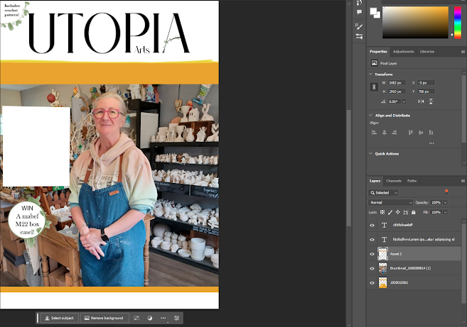
I added my 'Win' asset that I created with the pen tool using the brush tool 100. I want to change the white background colour to cream so that it looks more interesting.
I neatened up the yellow boarders using the pen and lasso tool to create straighter lines.
I changed the image size and its position so that the model is the main focus of the front cover but we can still see the pottery in the background.
I added a white box for secondary image to be placed over top.


I isolated the models hoodie using the magnetic lasso tool and increased saturation of hoodie
version 4

I decreased opacity added secondary image added text.
version 5

I added green text to my cover lines however I feel it clashes too much to the yellow background.
I changed the typography on 'win' and 'patterns' to be more cohesive with my magazine.
I increased the opacity on main heading as it is the most important story on the front cover.
version 6

I made the text larger and changed the dark green text to white as it is easier to read.

I have done a quick digital sketch of graphics I want to add that weren't in my original plan, I've added these graphics because I thought the main story line was to bear and didn't draw attention enough and I felt the magazine overall was lacking in its nature theme so to combat this I will depict vines that will be used as borders.
I added another white graphics in the bottom left corner as it looked to bare.


This vine boarder matches my other leaf graphics as I used the same brush type the swirls I added connote whimsy which relates to my art genre.

Originally I was just going to just use white text for the cover lines, but instead I decided to highlight the cover lines with yellow box's. The yellow box's are bright and eye catching and make the text stand out. The simple shape connotes the clean and minimalist aesthetic I am aiming to produce in my magazine.


DPS


UTOPIA Arts Magazine (google.com) Examples seen bellow:


I have also been given verbal feedback to decrease the price of my magazines to compete with competitors and align my cover lines and change the main cover line box from yellow to green to draw attention by creating contrast.


DPS
https://docs.google.com/forms/d/e/1FAIpQLSfVdE8x8SWhMgicgqJnEN3EDSVc6LCHuXqRtfpMid_wdWxGqg/viewform?usp=header


Because of this feedback I have decided to add more doodle graphics to my DPS such as plates cups and pots that relate to my pottery and art theme. I don't think I will change my heading colour as it creates contrast and draws the viewers eye. And I wont change the borders of my white box's as I think along with all of my text it will make my DPS to busy.
Assets


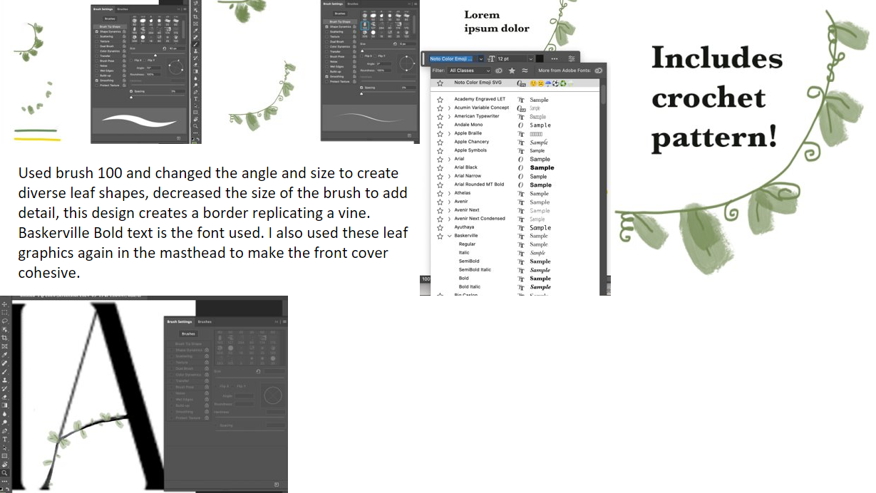
For this asset I used brush 100 and 30 in that same green I used from my other assets on my front cover and DPS using the colour pick tool. This graphic is meant to depict vines and leaves. I decreased the size of the brush using the slider and rotated the brush so that I could get a more varied and natural look.

I added in my front cover image and started to add in my text using the text tool.


I added in my headings, descriptions and page numbers. I added in boxes to plan out my layout.

I added in my assets and changed my text graphic to be the same shade of green using the dropper tool


Edited image in PowerPoint using the remove background tool to section of the sky and the mirrors reflection form gray to blue using the recolor tool so that it connoted summer instead of winter


I added in the page number '4', heading, and changed the colour of my box to yellow to match my house style using the colour pick tool.
Version controls
.PNG)
In my first version I loosely laid out where I wanted my images to go basing it off of my visualization diagram. I surrounded my contents page text with images that relate to the story's advertised in the text, so that my contents page could be more visually interesting and so that the reader can quickly see what is included in the magazine.
I added in a purple box as it contrasted with the green box and made it stand out, I did this as the story it links to is about colour.
I added in a graphics to my background and foreground to connote movement.
I added in my text based on my visualization diagram, however I did alter some of the headings numbers and descriptions.
.PNG)
Version 2
In my second version I added in my images in the top section and made shore they were evenly laid out with the grid tool. In the blue box I added in some colorful images but I didn't think they matched my theme so I later changed them.
I changed the purple box to blue so that it matched my images as it is a frequently used colour in my images so that the page looked more cohesive, however this didn't match my house style colours so I change it again.
I edited one of my headings and descriptions as I realized I duplicated the first heading '7' by accident.

Version 3
I changed my blue box to mustard yellow to match my house style colours. I then added in my images to link to my 'colours impact' story.
I edited my text so that I had no repeats and they all made grammatical sense.
I added in a dark green grid pattern to my green box, I did this because when I removed my proportions grid in the view tab, I realized the page felt to flat so I added in texture with the green grid.


Due to this feed back I have made some edits to my contents page:


Front cover Double page spread Contents page I have made a green box with a dark green grid pattern to highlight the important informa...