Showing posts with label LO3. Show all posts

Sunday, December 8, 2024

LO3: Creating production materials

Front cover 


Double page spread 


Contents page 


I have made a green box with a dark green grid pattern to highlight the important information of my contents page and draw the viewers eye with the bold colour. This feature fits my magazine as I have used my house style colour sage green, this colour is also used throughout the contents page via my graphics vines.


The heading is in the font Baskerville old face, this font connotes professionalism and easy reading. This fits my magazines small business theme as I have used a professional mode of address and typography. 


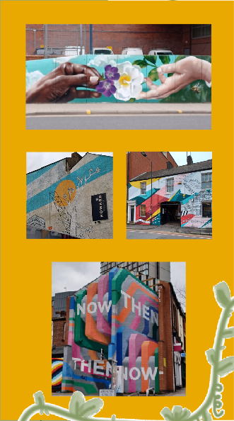
A yellow box has been used to highlight my photos and reinforce the theme of lively colour. I chose to photograph these locations that link to my colours impact story as they feature vibrant colour in an urban gray landscape. This yellow colour in my house style colour that I have frequently used throughout my magazine. 


Saturday, June 15, 2024

LO3: Following codes and conventions

UTOPIA Arts fits into real magazine codes and conventions of the small art business genre and targets audience of middle aged women because:

Front cover

The Photos I will use on my front cover features middle aged women that the reader can relate to and are encouraged to view them as an ideal self to do this I have taken Laura Mulvey's male gaze theory into consideration and subverted the male gaze by dressing my model appropriately. As the model's costume is an apron and hoodie it's relates to art genre and is also relatable to the target audience as hoodies are a mainstream clothing item. I have followed magazine codes and conventions with my main image and secondary image as I have featured a smiling mid shot of my model's on the front cover, used complimentary colours and as my focal point is sharing the eye line with the viewer it engages them to read the magazine. The lighting in my magazine is also a convention in art and small business magazines as warm daylight is relatable, comforting and connotes warmth and calm.


Front cover used to inspire me 

'Aesthetica' is an art and photography magazine. I used this magazine to help me understand and follow art magazine codes and conventions.

Like 'Aesthetica' in my main cover image I have focused on photographing one model and positioning them to be in the middle of the page. However instead of posing my model in a side view looking away from the reader like this front cover, I decided to take a forward facing photo so that the model eye line is directed at the reader. I did this in order to follow magazine conventions. by doing so I believe I am straightforwardly directly targeting my reader, unlike 'Aesthetica' that uses mystery and non conformity of magazine conventions in this main image to draw in the reader.

In my magazine I have used a secondary cover image I think this makes my magazine more appealing because it gives the reader more to look at, and allows them to understand visually that this magazine will feature people that look like the target audience. My secondary cover image connotes the theme of art and gives the reader an idea of what to expect from the contents of 'Utopia Arts'.

'Aesthetica' layout consists of a main image featuring a bold colour, along with at the top of their page a masthead and banner and at the bottom of their page bar code. Their house style includes white banners showing cover lines estimated to be in a size 8, they are positioned so that they don't interfere with the main cover image. All of their text is in a black serif font this causes high contrast with the background making their text professional and easy to read. Unlike my magazine 'Utopia Arts' They do not present a secondary images, buzz words or multiple graphics in their front covers to entice the viewer instead I think they rely on mystery and their well know brand name to advertise their product to the reader.

In this 'Aesthetica' front cover they chose a red colour scheme. This colour scheme is seen in the red circle graphic, the models costume is a red vest top paired with a sheer white blouse with red polka dots, the red fabric backdrop. I think this colour scheme works well to entice artists and photographers as its visually appealing and well planed. I could have followed their planning and created a similar colour scheme in my main cover image by instead of using yellow I'd use blue in my graphics to match my models blue apron, however I wanted to use a colour with happier connotations that would help me to stereotypically target middle aged women.

Because 'Aesthetica' red circle graphic is blocking out the models face this causes the audience to struggle to identify with the model, I think they target a wider audience by making her non descript. Where as in 'Utopia Arts' I have limited my audience to women. Their main target audience for this magazine are adults women because this image is not targeted at the male gaze. Their secondary audience are adult men, I think this because red is a stereotypically masculine colour and their design is not stereotypically femenin while still featuring only a female model.

Due to only using one word and designing their text larger in their masthead than tag lines 'Aesthetica' follows magazine conventions. Their masthead has influence my own design as I have also created a mastheads with a white background and black text in a serif font that is large and central at the top of the page. This help the audience easily identify my magazine brand and connotes my calming theme because of its plant graphic and elegant font.  

Unlike 'Aesthetica' my magazine includes many cover lines placed on the cover image instead of only in the banner because I wanted to follow magazine conventions. 'Aesthetica' only uses a banner because they favorizes photography. I also included a banner because I wanted to show my readers that their is allot of reading material for them in this magazine. In my cover lines I have used allot of buzz words such as Win and New unlike 'Aesthetica' as they only use cover lines with technical terms because they are targeting people in the art and photography industry.

Like 'Aesthetica' I have included a barcode in the corner of my page so that my audience can easily identify the price of the magazine. Unlike 'Aesthetica' I have used two puff's to draw in the reader with buzz words and clear information, this information denotes my magazines contents.


DPS & DPS used to inspire me

I used this 'Aesthetica' magazine double page spread to inspire my DPS as it is an art and photography magazine. I have followed codes and conventions of a magazine double page spreads by using columns for my text. The text itself follows conventions as the article body text is in a size 12, this size is the most common for magazine body text. I have followed my house style as I have used the serif font Baskerville old face.

My images fit my magazines art theme as they have been taken in art settings; in front of a pottery kiln and in a art workshop. They also fit my small business theme as the images are of a small business owner and their work space.

As my model is the only person in these photos, making her the focal point, this connotes her important to this double page spread, insinuating to the viewer that this women is the person being interviewed. This follows image conventions as in the Aesthetica DPS the light show pictures in the double page spread insinuates its the source material for the article.

Instead of following conventions and using images that take up all of or half of one page, I chose to priorities my article. This is because my readers are primarily interested in reading large amounts of text. The eye line of the model in the main image engages the reader as it targets them. I have also engaged my target audience of middle aged women by representing them with my middle-aged female model and my secondary audience of young adult women by using stereotypically femenin themes in my stories such as crafting and artwork.

Like 'Aesthetica' I used the same colour scheme on both pages so that they are cohesive as I have used my house style colours my DPS is cohesive with the rest on my magazine. 

The graphics I have used connote growth and movement and create synergy and brand recognition due to there uniqueness.


Contents page & contents page used to inspire me

As I have used my main cover image in my contents page the eye line of the model is directed at the reader creating engagement. I have also used an image I took of a bee on a flower, this links to my natural contemplation story, this image connotes happiness as the flower and bee are a bright yellow. I have taken a photo of the local gallery 'the site gallery' to link to my magazine theme of art and my contents page story 'natural contemplation'. To link to my 'sally's  Macrame' story I took a photo of a mcrame plant holder, due to the denotations of nature this image connotes peacefulness. As this image presents a hand made decretive product it links to my theme of art. Finally I have taken multiple images that relates to my magazine theme of art featuring art instillations local to Sheffield, I chose to photograph these locations to link to my 'colours impact' story, they feature vibrant colour in an urban gray landscape this causes them to connote individuality due to their contrast with the landscape. 

My layout for my contents page has changed from my initial plan seen in my visualization diagram as I needed to alter my layout to fit in the images that I had taken. The layout I ended with connotes good organization and professionalism due to its minimalism aesthetic, my layout follows conventions seen in Aesthetica contents page as I have used even placement with images and text. I have followed conventions with my images as they use similar colour schemes and aesthetics this is seen in the Aesthetica contents page as they have chosen images with different subjects in either blue or yellow so that they are cohesive.

The colour scheme of this page matches my house style colours of white, black, sage green and mustard yellow. I have chosen these colours as they connote happiness, tranquility and nature. This reflects my magazines values as I want to relax the reader and give them content they will enjoy. 

The graphic vines I created are featured throughout my magazine to create synergy and brand recognition due to there uniqueness.

My house style serif text is featured in my contents page as I have used the font Baskerville Old Face. This font connotes intelligence and professionalism due to how its minimalism aesthetic. The size of my text follows conventions as my headings are lager than my body text, this is proven as a convention as the Aesthetica contents page has also done this.

My main target audience of  middle aged women are targeted as I have included my front cover main image with a middle-aged female model. My secondary audience of young adult women have been targeted as I have photographed stereotypically femenin objects such as decoration and flowers.


Friday, April 19, 2024

LO3: Body copy for articles

Interview questions asked to Fired Up and Painting

1. what attracted you to creating this business

2. how did you get where you are today 

3. what do you like about pottery

4. What work Do you most enjoy doing

5. Who are you and what do you do

6. what themes do you pursue in your work

7. what Your favourite artwork

8. what / who has inspired you

9. What jobs have you done other than being an artist

10. what do you like/ dislike about your work

11. what is your dream project.

12. What type of clay do you use

13. How long does it take to complete your work 

14. How long have you been making pottery 

15. What temperature do you fire

16. What is a typical day of work for you

17. Do you sell your completed products online/ do you have an Etsy 


Version 1 Edited interview

I like how pottery is very unpredictable, clay in its raw state can dry to quickly, cause stress cracks, it's an enormous subject, I find it's like making a curry and playing with your spices until you create a consistent outcome your happy with. I have worked with pottery for 12 years those years included 3 years of intensely playing with recipes and making mistakes. I have 30 years of painting experience and a degree in fine art, I love art however there are many difficulties in becoming an artist, making an income is very difficult due to how limited and lacking opportunities are in the art world. Because of this I needed to find something to do with my degree, so I went into teaching, and it sucked the life force out of me , there was no time for my own work while teaching and I was fighting to regain creativity, but I had to think about making money and I still do now I have to think about marketing my art and paying the bills for my business. I enjoy working in a creative community because we can learn from each other, that's why in my workshops I want to help to get the creativity out of others and give them the confidence to tap into something they will be happy about producing. The creative process needs to flow and bounce its limitless, that’s why I like working faster and sporadically dipping between different protects, as much as I want to, I’m just too busy to sit and paint. I coexist In a collaborative group of female creators and makers; we support each other by networking and giving each other inspiration. My inspiration often comes from my customers, they have done so many things in their own  lives and they have such interesting stories , and the social impact of my business feels very important for my creativity. I love seeing allot of art online form lots of different people but some of my favorite artists are Nataly Rhyme , Kurt Jackson and Jolynn nelson. In my ceramics work I tend to pursue themes of habitat, weeds, birds’, manmade houses and natures forming houses, seascape and harbour’s. My work is very maverick it's not tied to a particular subject, I like using many different techniques and I then simplified my products to satisfy what shops need creating a body of 7 or 8 products is important. It takes about 4 week to complete my work proses. I use white earthen as it's a low fire clay for my own work and the pottery that can be chosen to paint this makes it energy efficient and cost effective. A typical day of work for me starts at half 8, I glaze pottery , unload the climb , have my staff wrap products, I clean, order stock  and sometimes set time aside for planning and developing products that I want to sell. I've expanded my business pottery painting business by focusing on canvas painting workshops. As the constants of potter painting is to exhausting, I want to the grow these workshops to be the focus of my business but first it needs to be supported by the pottery painting.


version 2 edited interview


I like pottery because it's very unpredictable, for example clay in its raw state can dry to quickly and cause stress cracks, which can lead to interesting outcomes in the pottery, it's an enormous subject, I find it's like making a curry and playing with your spices until you create a consistent outcome your happy with. I have worked with pottery for 12 years those years included 3 years of intensely playing with recipes and making mistakes. I dislike the admin side of running a small business but working in the Civil Service for 2 years gave me insight into a work ethic that has helped me to create my own business. I have 30 years of painting experience and a degree in fine art, I love art however there are many difficulties in becoming an artist. 20 years ago, making a living from painting was not realistic due to the lack of opportunities in the art world. Because of this I needed to find something to do with my degree, so I went into teaching, and it sucked the life force out of me and it made me feel like I lost my creative artistic self, there was no time for my own work while teaching and I was fighting to regain creativity, but I had to think about making money and I still do now I have to think about marketing my art and paying the bills for my business. 

I enjoy working in a creative community because we can learn from each other, that's why in my workshops I want to help to get the creativity out of others by using my teaching experience to create a productive space, help develop my customers skills and give them the confidence to tap into something they will be happy about producing. I've expanded my pottery painting business by purchasing the room above my current business setting to focus on my canvas painting workshops. The constant day to day demands of running the pottery workshop can be exhausting that’s why I want to grow the painting workshops into being the focus of my business but first it needs to be supported by the pottery painting business to pave the way. The creative process needs to flow and the range of creative projects I could get involved in is limitless, that’s why I like working faster and sporadically dipping between different projects, as much as I want to, I’m just too busy to sit and paint. 

I coexist In a collaborative group of female creators and makers that run similar businesses to mine; we support each other by networking ,giving each other inspiration and sharing our own techniques from our artistic knowledge. However, my inspiration often comes from my customers, when I chat to the them, I find out that they have done so many things in their own  lives and they have such interesting stories, I have found through covid isolation that the social interaction from my business is very important and impacts my inspiration when creating art and producing new painting workshops for customers. I love following seeing allot of art online from lots of different people but some of my favourite artists are Natalie Rhymer , Kurt Jackson and Glynn Masey. In my ceramics work I tend to pursue themes of habitat, weeds, birds’, manmade houses and natures forming houses, seascape and harbour’s. My work is very maverick it's not tied to a particular subject, I like using many different techniques this comes from teaching as I had to teach many different topics, I'm now comfortable with not catering to galleries who want a repetitive way of working and a set style. Once the creative process is over, I simplified my products to satisfy what shops need creating, perhaps a body of 7 or 8 products is required important. It takes about 4 week to complete my work process. I use ‘white earthen’ as it's a low fire clay and its cost effective for my own work and some of the pottery that is sold in my pottery paint business, this makes it energy efficient and cost effective. 

A typical day of work for me starts at half eight in the morning, I glaze pottery , unload the climb , have my staff wrap products, I clean, order stock,  and sometimes set time aside for planning and developing products that I want to sell, I create workshop advertisements and answer messages/emails on my business's social media. Some advice I have for other small art businesses is to: Try not to panic when things go quite and bills need to be paid just keep on growing and try your best, having a quiet period is a natural aspect for all businesses, expand your business by creating different workshops and aim for 10 bums on seats, create a good atmosphere in your business setting this is good for you and your staff's mental health as well as improving your customers enjoyment, Involve yourself in creative cooperatives as they can lead to more opportunities for example I'm going to the Fringe exhibition in Holmfirth to display and sell my work. Try to create advertisements on multiple social media platforms to access a larger audience. You can find me on My Instagram @firedupandpainting and My Facebook @firedupandpainting Sarah moss art.


Version 3 edited interview 

On April 13th I interviewed Sarah Moss, a female business owner about her pottery paint and work shop business at 'fired up and painting' in Aston Springs. 

Q/ Why do you like pottery? 
SARAH I like pottery because it's very unpredictable, for example clay in its raw state can dry too quickly and cause stress cracks, which can lead to interesting outcomes in the pottery. It's an enormous subject, I find it's like making a curry and playing with your spices until you create a consistent outcome your happy with.

Q/ How have you got where you are today? 
SARAH I have worked with pottery for 12 years, those years included 3 years of intensely playing with recipes and making mistakes. I dislike the admin side of running a small business but working in the Civil Service for 2 years gave me insight into a work ethic that has helped me to create my own business. I have 30 years of painting experience and a degree in fine art. I love art however there are many difficulties in becoming an artist; 20 years ago, making a living from painting was not realistic due to the lack of opportunities in the art world. Because of this I needed to find something to do with my degree, so I went into teaching, and it sucked the life force out of me and it made me feel like I lost my creative artistic self. There was no time for my own work while teaching and I was fighting to regain creativity, but I had to think about making money and I still do now as I have to think about marketing my art and paying the bills for my business.  

Q/ Why do you like the creative industry? 
SARAH I enjoy working in a creative community because we can learn from each other. That's why in my workshops I want to help to get the creativity out of others by using my teaching experience to create a productive space, help develop my customers skills and give them the confidence to tap into something they will be happy about producing.

Q/ How did you expand your business? 
SARAH I've expanded my pottery painting business by purchasing the room above my current business setting to focus on my canvas painting workshops. The constant day to day demands of running the pottery workshop can be exhausting, that’s why I want to grow the painting workshops into being the focus of my business, but first it needs to be supported by the pottery painting business to pave the way. The creative process needs to flow and the range of creative projects I could get involved in is limitless, that’s why I like working faster and sporadically dipping between different projects, as much as I want to, I’m just too busy to sit and paint. 

Q/ What or who inspires you? 
SARAH I coexist In a collaborative group of female creators and makers that run similar businesses to mine, we support each other by networking, giving each other inspiration and sharing our own techniques from our artistic knowledge. However, my inspiration often comes from my customers, when I chat to the them, I find out that they have done so many things in their own  lives and they have such interesting stories. I have found through covid isolation that the social interaction from my business is very important and impacts my inspiration when creating art and producing new painting workshops for customers. I love following allot of art online from lots of different people but some of my favorite artists are Natalie Rhymer, Kurt Jackson and Glynn Masey. 

Q/ How do you pursue your themes in your personal art?
SARAH In my ceramics work I tend to pursue themes of habitat, weeds, birds, manmade houses and natures forming houses, seascape and harbour’s. My work is very maverick, it's not tied to a particular subject. I like using many different techniques, this comes from teaching as I had to teach many different topics. I'm now comfortable with not catering to galleries who want a repetitive way of working and a set style. Once the creative process is over, I simplified my products to satisfy what shops need creating, perhaps a body of 7 or 8 products is required. It takes about 4 week to complete my work process. I use ‘white earthen’ as it's a low fire clay and its cost effective for my own work and some of the pottery that is sold in my pottery paint business. this makes it energy efficient and cost effective.  

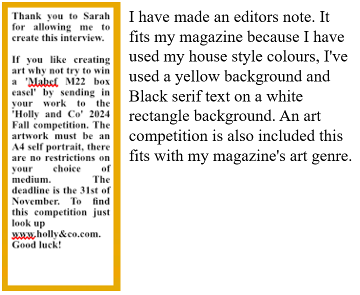
Thank you to Sarah for allowing me to create this interview.

If you like creating art why not try to win a 'Mabef M22 box easel' by sending in your work to the 'Holly and Co' 2024 Fall competition. The artwork must be an A4 self portrait, there are no restrictions on your choice of medium. The deadline is the 31st of November. To find this competition just look up www.holl&co.com.
Good luck!








Monday, April 15, 2024

LO3 setting up photoshop


The measurements I will use are the same as the 'Aesthetica' magazine.

width: 21cm
Hight: 29.5cm
gutter: 

300 raze is a high quality resolution used for printing in the publishing sector. this resolution means that the final product will not look pixelated. This resolution also means the file I will be using will be lossless. The only downside is the amount of storage it takes to save them.


LO3: Contact sheet and evaluation


In my Front Cover I will be using image number 4 as my main cover image and crop it so that it matches my mock up as a mid shot. I have chosen this image because she looks friendly and relaxed, and the background showcases her pottery shop. By using this model I have targeted my audience of 35-50 year old women  by giving them a relatable ideal self who is in the same age range and gender as them. I am using this image as the model is a small art business owner, I will be interviewing her as she will be the story of the main cover line and entire focus of my double page spread.

In my Contents page I will be using the same image I am using for my front cover it will be in the top left corner in a much smaller scale. 

In the Double Page Spread images 6,7,8,9 and 12 will be used. I will use image number 7&8 by combining the background from 8 with the model from 7 using the magnetic lasso tool on premier photoshop, this will create the main image on the double page spread. Image 9 will be half the size of the main image. Image 12 and 6 will be the same size as they both showcase settings relevant to the article.

Justifying the quality of photos used      

Image 6 will be used because the setting is relevant to the article. Image 12 is appropriate for the magazine because the setting is relevant to the article and reflects UTOPIA Arts recurring theme of nature and connotations of happiness and peace. I will be using image 9 as its aesthetically features tools and plants lit by the sunlight connoting a calming atmosphere and freedom of expression due to the brushes, sponges and other art equipment cluttering the image. Image 8 is being used because it has a better quality background due to the angle it is taken and it showcases a piece of important machinery to the business that links to my interview, image 7 will be used as it has better lighting than image 8 that highlights the model face bringing attention to her happy facial expression.

The images that are unusable include 1&2 as there is a glair on the glass case next to the model that is too distracting as it draws less attention to the model, image 3 as the model doesn't look relaxed enough to give of the right connotations I want the main front cover image to produce, image 5 as the door frame draws to much attention instead of the attention being the business inside as that is meant to be the purpose of the image, and images 11&10 are taken at the wrong angle therefore making them unsuitable.


LO3: Creating production materials

Front cover   Double page spread   Contents page   I have made a green box with a dark green grid pattern to highlight the important informa...