Front cover
Assets


In this version of my edit I experimented with the warmer 'sunshine filter' to emphasis the cozy and relaxing eathsteatic of my magazine. However I felt the filter causes the model to blend into the background making it not stand out enough.
However in this version I didn't like the shade of yellow so this was later changed, and due to seeing my masthead enlarged I have decided I want to decrease the size of masthead to look more elegant

I selected the shade of yellow I am happy with to create the borders.
Finalize the layout version 3

I added my 'Win' asset that I created with the pen tool using the brush tool 100. I want to change the white background colour to cream so that it looks more interesting.
I neatened up the yellow boarders using the pen and lasso tool to create straighter lines.
I changed the image size and its position so that the model is the main focus of the front cover but we can still see the pottery in the background.
I added a white box for secondary image to be placed over top.


I isolated the models hoodie using the magnetic lasso tool and increased saturation of hoodie
version 4

I decreased opacity added secondary image added text.
version 5

I added green text to my cover lines however I feel it clashes too much to the yellow background.
I changed the typography on 'win' and 'patterns' to be more cohesive with my magazine.
I increased the opacity on main heading as it is the most important story on the front cover.
version 6

I made the text larger and changed the dark green text to white as it is easier to read.

I have done a quick digital sketch of graphics I want to add that weren't in my original plan, I've added these graphics because I thought the main story line was to bear and didn't draw attention enough and I felt the magazine overall was lacking in its nature theme so to combat this I will depict vines that will be used as borders.
I added another white graphics in the bottom left corner as it looked to bare.


version control: version 1 vs version 8

Version control DPS


Review of assets

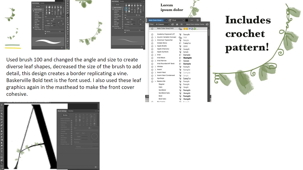
I have continuously used the same brush tool for the leaf pattern to make the front cover cohesive and only changed the size and angle of the leaf as well as added swirls to resemble shoots for texture.

This vine boarder matches my other leaf graphics as I used the same brush type the swirls I added connote whimsy which relates to my art genre.

Originally I was just going to just use white text for the cover lines, but instead I decided to highlight the cover lines with yellow box's. The yellow box's are bright and eye catching and make the text stand out. The simple shape connotes the clean and minimalist aesthetic I am aiming to produce in my magazine.


DPS


Client and audience feedback
UTOPIA Arts Magazine (google.com) Examples seen bellow:


I have also been given verbal feedback to decrease the price of my magazines to compete with competitors and align my cover lines and change the main cover line box from yellow to green to draw attention by creating contrast.


DPS
https://docs.google.com/forms/d/e/1FAIpQLSfVdE8x8SWhMgicgqJnEN3EDSVc6LCHuXqRtfpMid_wdWxGqg/viewform?usp=header


Because of this feedback I have decided to add more doodle graphics to my DPS such as plates cups and pots that relate to my pottery and art theme. I don't think I will change my heading colour as it creates contrast and draws the viewers eye. And I wont change the borders of my white box's as I think along with all of my text it will make my DPS to busy.
Contents page
Assets


For this asset I used brush 100 and 30 in that same green I used from my other assets on my front cover and DPS using the colour pick tool. This graphic is meant to depict vines and leaves. I decreased the size of the brush using the slider and rotated the brush so that I could get a more varied and natural look.

I added in my front cover image and started to add in my text using the text tool.


I added in my headings, descriptions and page numbers. I added in boxes to plan out my layout.

I added in my assets and changed my text graphic to be the same shade of green using the dropper tool


Edited image in PowerPoint using the remove background tool to section of the sky and the mirrors reflection form gray to blue using the recolor tool so that it connoted summer instead of winter


I added in the page number '4', heading, and changed the colour of my box to yellow to match my house style using the colour pick tool.
Version controls
.PNG)
In my first version I loosely laid out where I wanted my images to go basing it off of my visualization diagram. I surrounded my contents page text with images that relate to the story's advertised in the text, so that my contents page could be more visually interesting and so that the reader can quickly see what is included in the magazine.
I added in a purple box as it contrasted with the green box and made it stand out, I did this as the story it links to is about colour.
I added in a graphics to my background and foreground to connote movement.
I added in my text based on my visualization diagram, however I did alter some of the headings numbers and descriptions.
.PNG)
Version 2
In my second version I added in my images in the top section and made shore they were evenly laid out with the grid tool. In the blue box I added in some colorful images but I didn't think they matched my theme so I later changed them.
I changed the purple box to blue so that it matched my images as it is a frequently used colour in my images so that the page looked more cohesive, however this didn't match my house style colours so I change it again.
I edited one of my headings and descriptions as I realized I duplicated the first heading '7' by accident.

Version 3
I changed my blue box to mustard yellow to match my house style colours. I then added in my images to link to my 'colours impact' story.
I edited my text so that I had no repeats and they all made grammatical sense.
I added in a dark green grid pattern to my green box, I did this because when I removed my proportions grid in the view tab, I realized the page felt to flat so I added in texture with the green grid.


Feedback from google form questions


Due to this feed back I have made some edits to my contents page:


No comments:
Post a Comment