Sunday, December 8, 2024

LO3: Creating production materials

Front cover 


Double page spread 


Contents page 


I have made a green box with a dark green grid pattern to highlight the important information of my contents page and draw the viewers eye with the bold colour. This feature fits my magazine as I have used my house style colour sage green, this colour is also used throughout the contents page via my graphics vines.


The heading is in the font Baskerville old face, this font connotes professionalism and easy reading. This fits my magazines small business theme as I have used a professional mode of address and typography. 


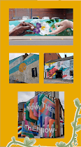
A yellow box has been used to highlight my photos and reinforce the theme of lively colour. I chose to photograph these locations that link to my colours impact story as they feature vibrant colour in an urban gray landscape. This yellow colour in my house style colour that I have frequently used throughout my magazine. 


No comments:

Post a Comment

LO3: Creating production materials

Front cover   Double page spread   Contents page   I have made a green box with a dark green grid pattern to highlight the important informa...