Purpose
The purpose for UTOPIA Arts is to entertain the viewers in their free time and provide information to enjoy and learn from as a relaxing activity. Another purpose for my magazine is to promote and advertise different local artistry business and events in Sheffield.
Form and Genre
Utopia Arts is a magazine local to Sheffield this is because I want readers to use the magazine to network and advertise their business to the people located closest to them. The genre of UTOPIA Arts is 'local arts business' this means the magazine will be focused on small business in the area off Sheffield that are in the production of different types of art.
My ideas for my house style, cover lines and articles reflect my genre as they denote themes of art and business and connote calm creativity and professionalism.
Content
Front Cover
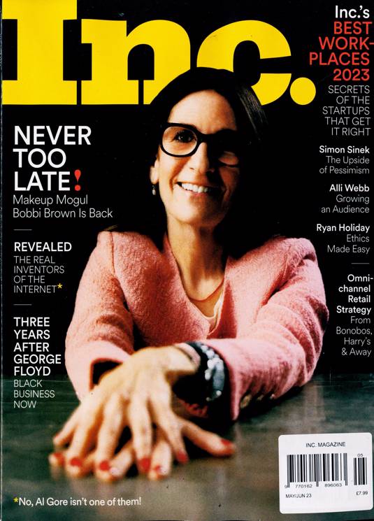
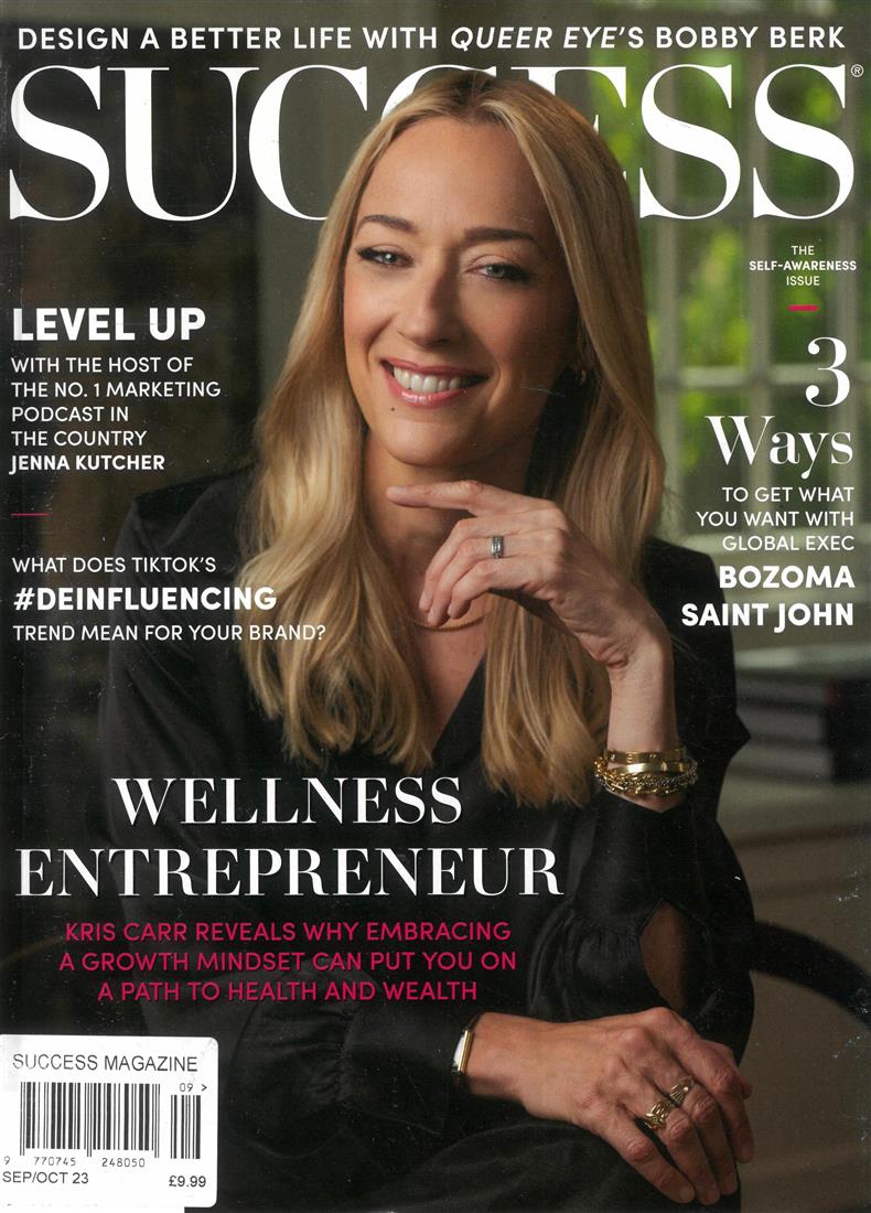
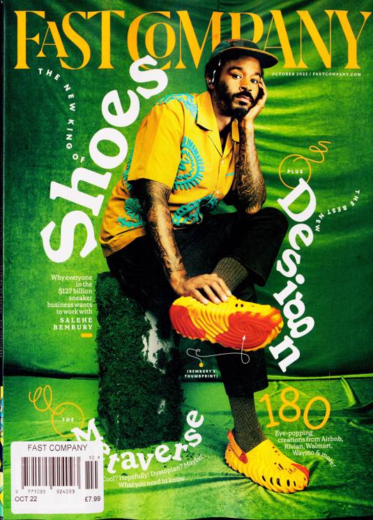
The Masthead of my magazine is called UTOPIA Arts. I have chosen the serif style font as I wanted it to connote simplicity boldness and be easy to read. I added leaf graphics on the 'A' in green I did this to connote nature, peace and positivity, this reflects the magazines values as a peace of media used to entertain and relax the viewer on art related topics.
The banner cover lines are in black text they contrast with the white background connoting syplyseity this means the viewers will assume the magazine is well planed and reading the articles in the magazine won't be inconvinient for the reader. The banner is outlined with a mustard yellow, the yellow connotes the contents of the banner will be exciting and will viewer happy when reading.
I have chosen the serif Font style called Baskerville Old Face, the majority of the text will be in black but there will also be sage green text. The sage green text will be used to pull attention to the viewer it will do this as it contrasts against the background to connote its importance. For example 'important text' will include cover lines, buzzwords. Other features of the magazine will also be in sage green such as the graphics as they will be used to surround important features.
The House style colours of my magazine include; black, white, sage green and mustard yellow. These colours connote the magazine is cheerful, natural, friendly, orderly and pleasant.
The Cover lines from this magazine include Sally's Mcrame, City life, Natural contemplation, colours impact, 2024 Hottest Creatives!, Flower pressing Masterclass, New and emerging, Events near you, Dynamic Expression, How to access your community, confronting marine pollution, Layered Narratives, Resisting stereotypes, Shaping the future, Win. All of these cover lines fit the Genre of my magazine because they include events local to Sheffield this fits the magazine as it is a local magazine, it covers my genre of local arts business And my audience will be engaged in them because they cover topics such as art, social events, environmental issues and how we view society these are all topics my imaginary entity will be interested in therefore the majority of my audience will also be interested in them.
The Main cover line 'Fired Arts Sheffield' and pull quote 'where people of all ages can get creative with a range of artistic activities' they fit the genre of my magazine because it is a pottery painting business local to Sheffield owned by a middle aged woman.
In my Main cover image the model will be the business owner of 'Fired Arts' in a medium long shot she will be looking away from the camera to the left smiling this will hopefully make the audience feel left out, making them want to read what's in the magazine so that they are included. She will be stud in a relaxed position to connoting that the reader will feel calm and happy like her while reading the magazine. Her costume will be modern clothing, for example jeans and a t-shirt connoting a relaxed and casual atmosphere to the viewer so that the viewer can easily relate to the model as they will wear similar clothing in their day to day life.
Contents page
The types of article featured in this magazine include interviews with artists, an opinion peace on 'Sally's Mcrame' an Esty business owners artwork and 'City life' an art exhibition, an information peace on 'colours impact', and a think peace on 'Natural contemplation'. The images I will have in my magazine are examples of artwork from the 'city life' exhibition, the main front cover photo of the Fired arts business owner and an image of 'Sally's Mcrame' posed making her art work. In my magazine there will be a competition to win a Mabef M22 box easel this will draw in readers that are interested in art and artist equipment.
Double page spread
page 1
The Photo featured on page 1 will denote at least 3 examples of pottery painting from Fired Arts shaped to resemble a polaroid picture, this will connote the theme of photography. The Headline title's include 'Interview', 'Advertisement', 'work shops', 'other work' and 'typical day of work'. The colour scheme on both pages of the double page spread will include a mustard background and beige box's for black text. This colour scheme conotes reading the DPS will cause happiness and calm for the viewer.
page 2
The main Photo of the double page spread will be a pitcher of the business owner of fired arts as she is the topic of the double page spread and my target audience, she will be in jeans and a t-shirt and she will be posed throwing or decorating pottery. This image connotes calm and creativity. The Lead of the 2nd page is 'My proses' this will be an interview with the business owner of Fired arts discussing what she does in her Job as a business owner, the Pull quote on the front cover will be from this article. This article themes connotes hard work and progress over time.
The Target audience is an ABC1 audience aged 35-50, that have free time to spend reading while working from home or to read while commuting to there job or to simply read in there free time to use as a way of relaxing. An ABC1 audience will stereotypically want something more intellectual to read that is why there are allot of cover lines to advertise they will have a large source of articles to read in the magazine, they will also have an disposable income that allows them to afford a magazine for there hobby in art as self indulgence. The magazine will target a female audience by mainly using female models in a wide range of ethnicity's and cultural groups aged similarly to the magazine's target audience. The images of these women will showcase them as ideal selves instead of ideal partners representing them as powerful, intelligent and capable.
To better understand my target audience I have created an imaginary entity based on my ideal audience member: Leo French is a 40 year old Hispanic, middle class women who is the business owner of a popular new online pottery business she works from home and uses Instagram to advertise and cell her business's products, she is looking to hire staff as her business is becoming difficult to manage by herself to do this she will use UTOPIA Arts magazine to find local events near her where she can network with other business owners and business to hire staff and create partnerships with other businesses.
The Resources and Personnel for UTOPIA Arts will be only Suzie Booker (myself) working as the editor, photographer and graphic designer for the magazine. The hardware needed for the process of making this magazine is a laptop/computer and a phone or camera. The software needed is Adobe photoshop I will use this software form graphics design and to edit the photos. The models I need include the business owner of 'Fired arts' she will be featured on the front page as the main cover image, because her business is the topic of the main cover line, she will also feature in a different pitcher on the double page spread as she will be the focused of the articles on the double page spread. I will also need other female models in the age range of 35-50, they will be other artists/ business owner located in Sheffield.
Distribution and marketing methods, My magazine will use synergy by promoting UTOPIA Arts on Its online platforms on Instagram and Facebook to target my 35-50 target audience, Instagram will be used to target 35-40 year old's and Facebook will be used to target 40-50 year old's. The profile picture for these accounts will be the masthead of the magazine shaped into an arc and there will be leaf emojis in the bio of theses accounts as the magazine regularly uses leaf graphics it will link to the design of the magazine. On these social media platforms they will post images of the latest released front covers of UTOPIA Arts this will be effective as it will appeal to the intended audience and pique interest .I will also include a short videos/ clips of interviews that will be made into articles to be put into the magazine this short form content will be used as teasers for what can be read in the magazine this will be effective because it will pique interest and leave them wanting more information therefore buying the magazine. I will also promote UTOPIA Arts on the radio this will access listeners on their way to work transporting in cars or listening on their phone on public transport, this will be effective because I will have a wide reach to a large audience and as is is audio it will engage my audience efficiently, advertising on a range of platforms will create horizontal integration. My magazine will print 1,000 copies to cell in stores and circulate through Sheffield. My magazines will be printed monthly to keep up to date but not once a week as the small business genre is niche. The size of my magazine will be A4 as I want it to be easy to read and present images clearly. As my magazine targets women the gender ratio stats would be 11% male and 89% female. 80% of my audience would be in the ABC1 demographic.

The camerawork in my magazines when photographing my models will mainly consist of eye level medium close up shots, mid shots and full shots. When I am taking a photo of a setting in will use eye level wide shot's and medium shot's. As well as high angle close up's.
In media my target audience of middle aged women are often viewed with biases perceptions do to societal ideologies. They are often misrepresented by harmful stereotypes such as being grumpy, nagging and kooky due to ageing, these stereotypes can perpetuate and reinforce sexist and ageist biases. They are mostly overlooked in media in order to comply with the male gaze. To make sure I am representing my target audience ethically I will try to use Representation theory, introduced by Stuart Hall. 'Hall suggests that identities, for example, race, gender or class, are not fixed but constructed and ‘represented’ through media.'. I will convey the identities and ideas of my models through the images I take, in the symbolism in my graphics and the language I use in my tag lines and articles. I am doing this so that my audience understands the decoded meaning of my magazine is that middle aged women are; capable, strong, intelligent, opinionated and creative. I hope to create a preferred reading in my article that allows the audience to accepts and understands the message I intended.
.png)


.png)