Front covers - small business genre
inc. - magazine
success - magazine
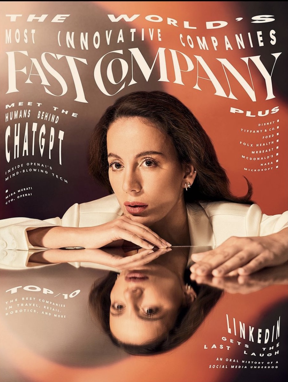
fast company - magazine
content pages


double page spreads
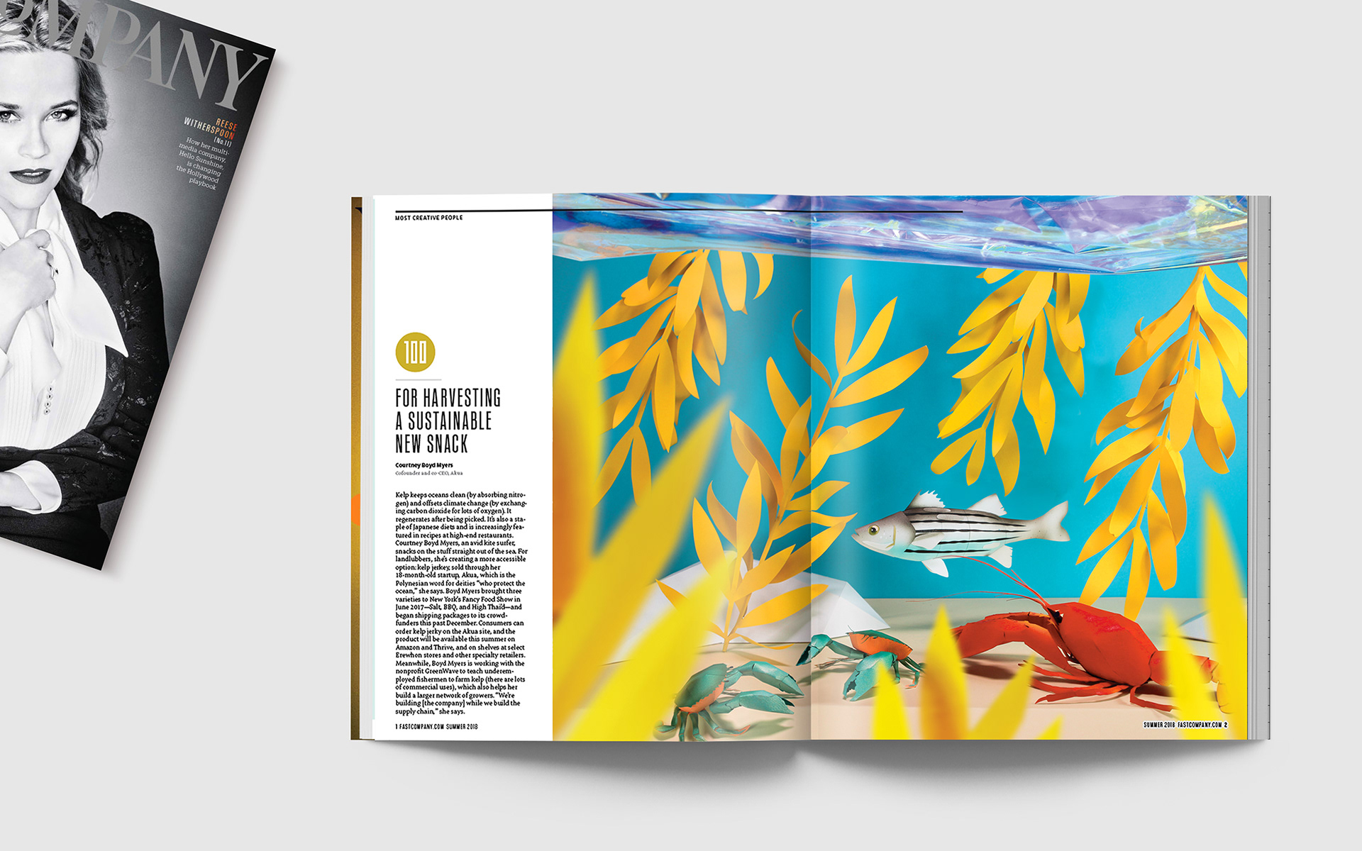

fast company - double page spread


no more than 500 words
1. what I like/ strengths I have found: good mis-en-sen, bold colours that draw the eye, clear typography, good quality images, consistent typography colour, use of graphics, icons and buzz words, pops of bold colours in the content pages used to draw the eye, use of borders, iconography, the font colour stands out from the background.
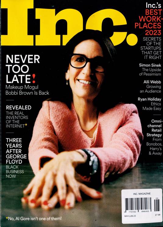
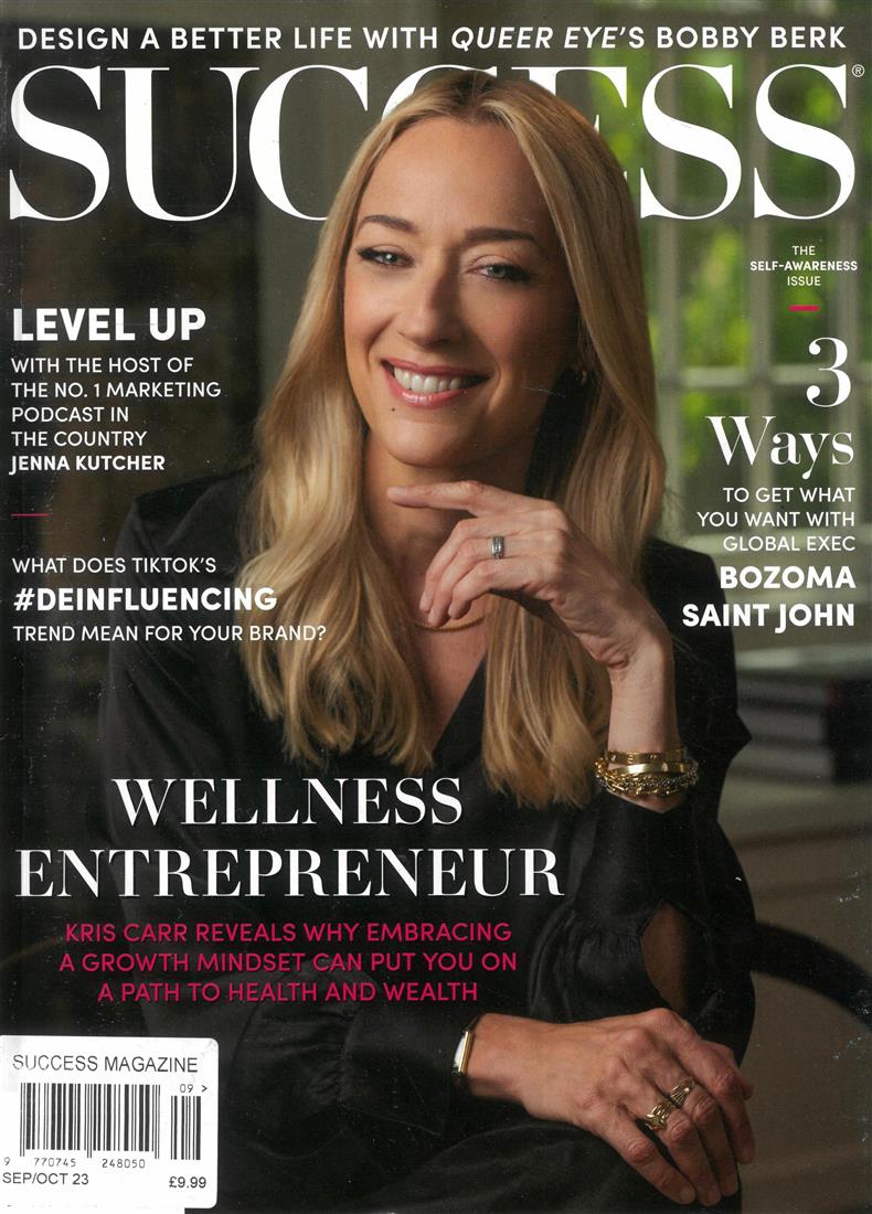
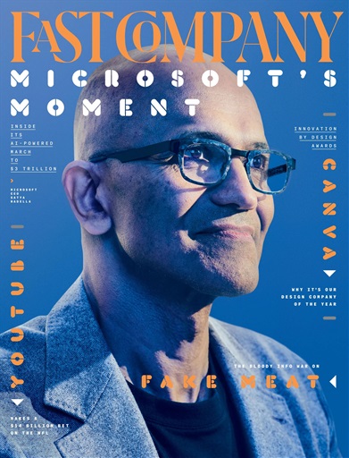
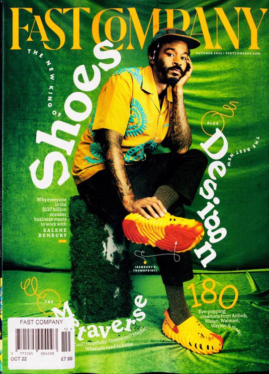
2.common themes in the small business genre: one mid-shot Picture of a business owner on the front cover is very common. The picture of the business owner on the front cover appeals to there target audience because they may be able to relate and identify with them. Small chunks of text on the front cover advertise what's in the magazine this appeals to people with a small amount of time (business people) because they can quickly find if the magazine has something they want to read in it instead of going through the entire magazine.Large masthead at the top of the magazine allows you to identify the brand so you can keep going back to the magazine you like about the topic you like. Barcode sticker at the bottom of the magazine, tells the customer your price. Bold background colour that draws the eye makes the audience more easily drawn to it especially if there looking for something creative (like the poetry magazine I want to make). All of the models are wearing business weir or expensive looking clothing to show the audience what their trying to present is something sophisticated and classy to align with their topic of professional businesses. Blue is a commonly used colour for these business magazine this may be because the colour blue connotes ... and draws the eye.
3.how are these magazine examples going to influence your ideas: I want to use similar typography and vibrant colour theme similar to the fast company magazine. I also like how the fast company keeps a semi consistent colour scheme like the first fast company magazine I've shown, they keep a blue colour scheme in the costume background and lighting, this gives it a consistent mis-en-sen. I also like the column formatting in most of the content pages I've shown as it looks clean appealing and easy to read.


No comments:
Post a Comment